I am going to link about 3 different blogs together to paint the story of stupidity at its finest. Basically, one person thinks that cartoon artwork on a 6pack of beer is offensive. Remember, you need to be 21 to purchase beer. You need not be only 18 to get into a stripclub. Formulate your own opnion but here are the facts.
BOSTON/IPSWICH (CBS) – An up-and-coming local craft beer maker is laughing off accusations that its labels are sexist, racist, and downright offensive.
The company is called Clown Shoes, so as you’d expect, they try not to take themselves too seriously.
The North Shore company’s founder, Gregg Berman, says that easy-going philosophy can best be seen in the names the brewer chooses for its products.
“We try and find something that is entertaining and humorous,” Berman says. “A little edgy and provocative, but we’re really not looking to go extreme or insulting or offensive. We’re looking to engage people with our sense of humor.”
Some of Clown Shoes’ names and labels are certainly provocative: “Tramp Stamp”, “Brown Angel”, and “Lubrication” (and the artwork that accompanies them) are meant to catch the eye and entice a shopper to buy.
But, those names and pictures are getting the company some unwelcome attention.
This week, someone at the influential Cambridge-based
Beeradvocate.com took offense. The debate is brewing around a
post on the Beer Advocate website by
Candice Alström, the site’s Director of Events and Promotions.
It read, “I took a lot of crap from people because I felt like the (brewer’s first) label was tacky and borderline sexist or racist.” It goes on to chastise the company over a number of “classless” labels that followed, saying if the beer was good, the company shouldn’t need to resort to gimmicks to sell it.
That kicked off a furious debate with hundreds of postings, until the site shut it down. That debate continued on Facebook, Twitter, and other sites frequented by beer aficionados.
“It keeps reminding us not to take ourselves too seriously and have humility and continue to have respect for our craft,” Berman said. “Honestly, our branding is silly. It’s meant to be fun and engaging but it’s silly.”
The woman who designed the label, Stacey George, says there’s absolutely nothing sexist about the images she created. She
responded on her blog by acknowledging that some people were going to be offended, but pointing out that the urban dictionary defines clown shoes as “something that is ridiculous in its appearance or existence.”
Matt Gamble, the company’s Director of Operations, says he understands the labels get all the attention, but he’d rather Clown Shoes just be known for putting out a good product.
“The first impression you get is this is great beer, and then the labels are secondary. They’re meant as lighthearted jokes about society or the industry,” said Gamble.
No one at beeradvocate.com would go on camera to talk about this story. An initial e-mail from the site’s founder suggested that the controversy stemmed from genuine consumer-based displeasure with the labels and names. But, when it was pointed out that the anti-Clown Shoes posting was in fact written by the site’s Director of Events and Promotions (and wife of one of the founders), Founder Todd Alström responded “The only official BeerAdvocate posts on our website come from my brother and I. Anything else is simply … not from us.”
Clown Shoes also responded to the firestorm of sorts that Alstrom created; offering
an over-the-top tongue-and-cheek response on its Facebook page.
WBZ-TV’s Jim Armstrong contributed to this report.
Dear Beer Consumers,
We would like to take this opportunity to apologize to each and every one of you.
We are sorry for forcing everyone to have to endure the huge amounts of physical and psychological trauma we have caused by putting pictures of robots and cartoon women on our beer labels. God forbid you manage to actually open the bottle after seeing the horribly offensive labels because, as we all know, beers with an average rating of B+ are not even that good and shouldn't be drank by anyone.
We are sorry for even considering the thought that we should try and be funny with our packaging and are taking steps to remove all images and colors from our labels. From this point forward, all of our labels will be primarily government warnings on a white label with a small section that has the name of the beer on it.
As a result of this PR fiasco, I have personally fired every person on our design team, without severance, and submitted their names to a FBI watch list for people who have terrible senses of humor. We will be replacing them with unemployed accountants, all of whom I have personally screened to ensure that they have no sense of humor whatsoever and will not go "outside the box" when designing new packaging.
We are also making some changes to our existing line-up of beers:
-Brown Angel will now be called "Colorless Angel"
-Eagle Claw Fist will be renamed "Non-Descriptive Bird Appendage Fist" to avoid any further offense to eagles or claws
-HoppyFeet will be changed to "Opaque IPA"
-Tramp Stamp will be renamed "Lower Back Tattoo" to avoid any conflicts with the NAWWRGTS (National Association of Women Who Regret Getting Tramp Stamps)
-Lubrication will be renamed "Slippery Petroleum Byproduct" so that no one will ever think of a dong when they see it
We are also taking steps to stop production of our new beers for fear that they also may be offensive to someone. We are actively brainstorming new ideas for names and packaging that will be so unoffensive you would think that Disney designed them.
We would like to take this time to thank Candice Alstrom for using her influential position as a Beer Advocate staff member to voice her opinion in the most visible way possible about our brand. We would not exist if it weren't for constructive consumer criticism like this, especially when people of authority share it publicly. It is our opinion that anyone who has the power to express themselves should always do so, particularly when the setting in which you do so lends you extra credibility beyond that of normal discussion participants.
As a measure of public service, we are drafting a letter of petition that the community can send to any brewery who uses sex or humor in their packaging. Once our crack team of lawyers has poured over it, we will circulate it through the proper channels to be signed and distributed to all offending breweries.
Additionally, we have created a new email address, beerpolice@clownshoesbeer.com, so that any member of the public can inform us of a label that offends them then we can take the appropriate action to stop the offense.
Signed,
Clown Shoes Beer

Meeting on the Mound
Last night, my friend, Cathie, invited me and my son to join her and her daughter for the Sox vs. Jays game at Fenway. We had amazing seats, first base line, 7th row, you could almost touch the players, it was too much fun.
About halfway through the 4th inning my phone started buzzing with Facebook posts and text messages all related to
this article on Boston.com. The post was referring to a kerfluffle on Beer Advocate in which a contributor to the site launched a full out rant aimed at my client, Clown Shoes Beer, and their sexist, racist labels. The diatribe resulted in a 350 comment thread in which people both agreed with the original post or defended Clown Shoes’ right to be, well,
clownshoes. It also included a comment in which the original poster quoted me out of context and made it seem like I agree with her. The thread was locked before I got home from the game, leaving me with no opportunity to defend myself.
So, this is my response to the question, “Are Clown Shoes’ labels offensive?” Sure. Why not? Offensive is a subjective term. If you look at the labels and find yourself offended, there you go. Do you have the right to say so? Abso-friggin-lutely! Shout it from the highest mountain, or your Twitter account, or your brothers’ website, whatever your bullhorn is, use it, loud and proud. Here, let me loan you a sandwich board and a bell, you can be offended Town-Crier style, I got your back.
I get it. There are things that offend me. For instance, due to an unfortunate misunderstanding of lyrics, I cannot listen to Sublime’s Wrong Way without getting offended. Politicians who proudly misunderstand the basic facts of American History offend me—mostly because they’re too lazy or stubborn to find out the right answers and correct themselves. Those ASPCA commercials with Sarah McLaughlin offend me because they always run them in the middle of South Park, or Tosh.O and then I feel guilty for laughing when we come back from commercial. So, if someone looks at the illustrations I’ve done for Clown Shoes and finds them somewhat distasteful, then you go on with your bad self and be put out. It’s your right.
However…
My labels for Clown Shoes—which were named
Best Craft Beer Art of 2011 by PourCurator.com—are not illustrated with a sexist intent. For instance, a
Tramp Stamp is a tattoo placed on the lower back of a woman to emphasize her sexuality. In Germany, they call it, Arschgeweih, meaning, “Ass Antlers.” Can you imagine if we had named a beer Ass Antlers!? We have nicknames for these tattoos because they have a purpose. The woman who has one is confident in her sexuality and she is enticing the viewer to appreciate her. A woman who is comfortable in her own skin and likes how she looks is a sexy woman. Sexy is not sexist. In fact, sexist is rarely sexy.
Brown Angel is a mix between pin-up girl, Blaxploitation goddess, and hip-hop diva. She was inspired by Pam Grier in
Coffy, and Rosie Perez dancing to Fight The Power in the opening of
Do The Right Thing. These are powerful women, not victims, and just because they have ethnicity, doesn’t mean the label is racist any more than appreciating a Bettie Page pin-up makes one a white supremacist. As a woman, and an artist, I have a hard time with either of these images being labeled chauvinistic. Chauvinism is an attitude of superiority over the opposite sex. I’m not designing woman who are inferior, I’m designing women who celebrate who they are. So, who is bringing the inferiority? The viewer? The offended? It’s a complicated question.
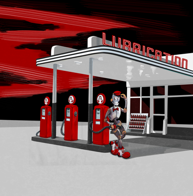
Finally, and this one made me guffaw, I mean seriously spit take—Clown Shoes Lubrication. Why is Lubrication offensive? Well, first, we’ve got the name. It’s tongue-in-cheek, it’s having some fun, but the label copy pulls it all together, “Lube? Hey, get your mind out of the gutter. Social lubrication, people coming together to unwind, is what we’re talking about.” This is not a dirty joke for the sake of being dirty. Lubrication is an American Black Ale, dark as oil, but at only 6% ABV it’s one of Clown Shoes’ first sessionable beers. The social lubrication marketing gives you an idea what you’re getting in the bottle.

Clown Shoes Lubrication, Full Illustration
Second, the illustration is apparently offensive because of the placement of the gas nozzle. Next time you fill your tank, take note of how high you hold the nozzle, I’m guessing it’s not up by your belly button unless you drive a Hummer. Apparently, our critics saw not a dispenser of fuel, but a “dong.” Yes, their words, not mine. I went to art school. I was taught to say,
“phallic symbol.”
Now, let me tell you, when I designed this I was inspired by
Ed Ruscha’s gas station paintings, 1950′s sci-fi robots, and by those old
Texaco commercials with the jaunty hats and ties. That’s it. You get your car lubed at the service station and a tin-man requires lubrication, it works both ways. The client actually wanted to go sans-illustration for this beer, but I convinced him that it would be inconsistent with the brand and that I had a great idea! Never in my wildest imagination did I think this label would inspire such vitriol! But when you have
dong on the brain, you see
dong wherever you go, I guess. Ironically, robots don’t even have sex that way, there’s a lot more welding and screaming of 0s and 1s.
*
So, there you go. If you find your way to my website because I illustrated some beer labels that started a tiny tempest, you will see that I put a lot of thought and research into offending people and selling beer. I also design yearbooks for
elementary schools and websites for
stores your mom would probably like. I appreciate this opportunity to respond to my critics and I encourage you all to drink good beer with a sense of humor and an open mind.


 Reporting


